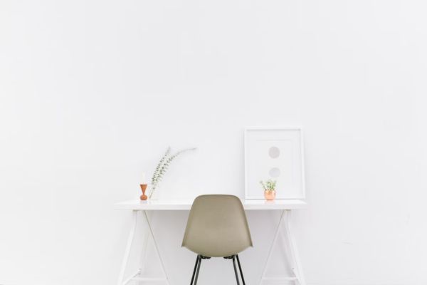
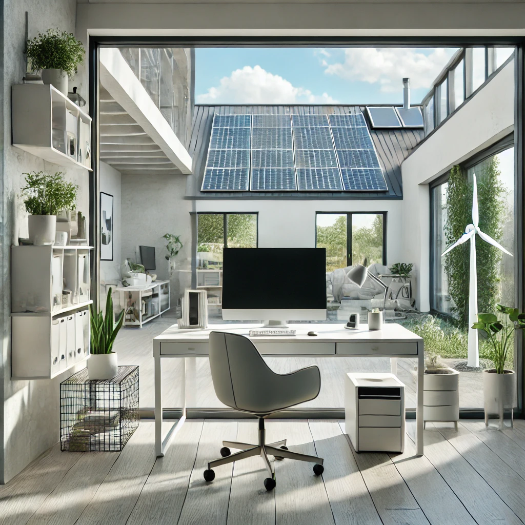
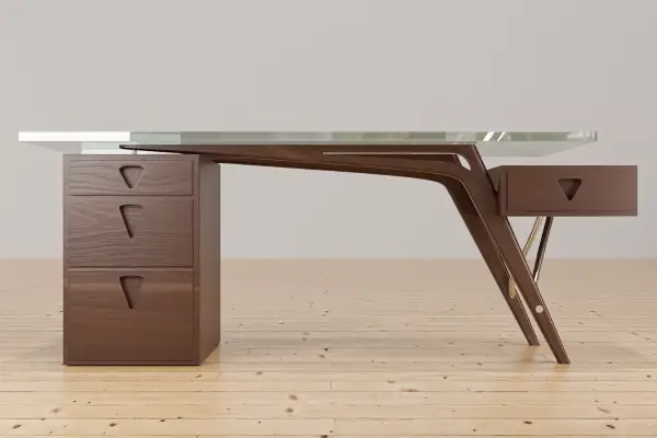
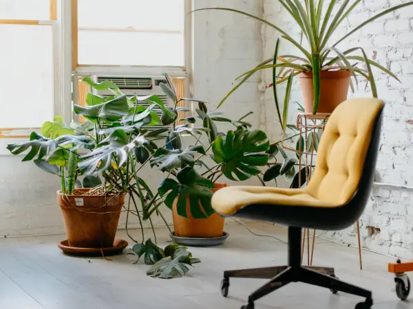
Minimalism has become a popular trend in office decor, celebrated for its simplicity, functionality, and ability to create a serene work environment. A minimalist office is characterized by clean lines, a neutral color palette, and a clutter-free space that enhances productivity and focus. The goal is to create a workspace that is both aesthetically pleasing and efficient, with every element serving a purpose.
One often overlooked aspect of minimalist office decor is wall art. While minimalism tends to avoid excess, the right wall art can play a crucial role in adding personality and warmth to a space without compromising its minimalist principles. Wall art can act as a focal point, bring balance to a room, and provide inspiration and motivation throughout the workday.
This article aims to guide you through the process of decorating a minimalist office with wall art. We will explore how to choose the right pieces, the best ways to arrange and position them, and tips for maintaining a cohesive and serene workspace. Whether you are starting from scratch or looking to update your current office decor, this guide will help you infuse your minimalist office with style and creativity.
Understanding Minimalist Design
Definition and Principles of Minimalist Design
Minimalist design is centered around the idea of “less is more.” It emphasizes simplicity, functionality, and the elimination of unnecessary elements. The key principles of minimalist design include:
- Simplicity: Using straightforward forms and structures without intricate details.
- Functionality: Ensuring every element has a purpose and contributes to the overall efficiency of the space.
- Clean Lines: Favoring sharp, uncluttered lines and shapes.
- Neutral Colors: Utilizing a palette of whites, grays, and natural tones to create a calm and cohesive environment.
- Clutter-Free Spaces: Keeping surfaces and spaces free of excess items to maintain a sense of order and tranquility.
Benefits of a Minimalist Office Space
Creating a minimalist office space offers numerous advantages, both aesthetically and functionally:
- Enhanced Focus: A clutter-free environment reduces distractions, allowing for better concentration and productivity.
- Stress Reduction: The simplicity and order of minimalist design can create a calming atmosphere, reducing stress and promoting a sense of well-being.
- Easy Maintenance: With fewer items and simpler designs, minimalist spaces are easier to clean and maintain.
- Aesthetically Pleasing: The clean lines and neutral color palette create a visually appealing and timeless look.
- Improved Organization: A minimalist approach encourages the use of functional storage solutions, leading to better organization and efficiency.
Role of Wall Art in Minimalism
While minimalism often emphasizes simplicity and functionality, wall art can play a crucial role in enhancing a minimalist office without compromising its principles. Here’s how wall art integrates with minimalism:
- Adding Personality: Carefully chosen wall art can infuse your office with a touch of your personal style and character, making the space feel uniquely yours.
- Creating Focal Points: A strategically placed piece of art can serve as a focal point, drawing the eye and adding visual interest without overwhelming the space.
- Balancing the Space: Wall art can help balance the room by adding color and texture, preventing the space from feeling too stark or sterile.
- Inspiration and Motivation: Art can inspire creativity and provide motivation, making your workspace more engaging and dynamic.
- Subtle Enhancement: Minimalist wall art, with its simple forms and subdued colors, complements the overall aesthetic, enhancing the minimalist vibe without adding clutter.
By understanding these aspects of minimalist design, you can effectively incorporate wall art into your office decor, creating a space that is both functional and inspiring.
Placement and Arrangement
Tips for Positioning Wall Art in a Minimalist Office
Positioning wall art in a minimalist office requires a thoughtful approach to ensure it enhances rather than overwhelms the space. Here are some tips to help you get it right:
- Consider the Layout: Before hanging any art, take a good look at your office layout. Identify blank walls and spaces that could benefit from a visual boost.
- Symmetry and Balance: Symmetrical arrangements can create a sense of balance and harmony, which is essential in minimalist design.
- Keep It Simple: Less is more. Avoid overcrowding walls with too many pieces. One or two well-placed artworks can make a more significant impact.
Centerpieces vs. Gallery Walls
Choosing between a single centerpiece and a gallery wall depends on your office space and personal preference:
- Centerpieces: A large, single piece of art can serve as a striking centerpiece. It’s perfect for creating a focal point and can make a bold statement without overwhelming the space. Place it above a desk, sofa, or console table to anchor the room.
- Gallery Walls: A curated gallery wall can add personality and interest to your office. For a minimalist approach, select a few cohesive pieces with similar color schemes or themes. Arrange them in a clean, geometric pattern to maintain the minimalist aesthetic.
Height and Spacing Considerations
The height and spacing of your wall art are crucial for creating a harmonious look:
- Optimal Height: Hang artwork at eye level, typically around 57-60 inches from the floor to the center of the art. This ensures that it’s easily viewable and visually pleasing.
- Spacing Between Pieces: If you’re creating a gallery wall, maintain consistent spacing between each piece. A gap of 2-3 inches works well for a cohesive look.
- Proportion to Furniture: Ensure the size of your wall art is proportionate to the furniture below it. A piece that is too small or too large can disrupt the balance of the room.
Balancing Wall Art with Other Decor Elements
To maintain a minimalist vibe, it’s essential to balance wall art with other decor elements:
- Complementary Decor: Choose decor pieces that complement your wall art without competing for attention. Simple, functional items like sleek desk organizers, minimalist lamps, and neutral-toned furnishings work well.
- Negative Space: Embrace negative space. Allowing empty areas around your wall art and decor can create a sense of openness and tranquility.
- Harmonizing Colors: Coordinate the colors of your wall art with the overall color scheme of your office. Subtle hues and neutral tones can tie everything together seamlessly.
Using Wall Art to Create Focal Points
Wall art can effectively create focal points that draw the eye and add interest to your minimalist office:
- Statement Pieces: Use large, bold pieces to create a central focal point in your office. This could be above your desk, on a feature wall, or opposite the entrance.
- Layering Textures: Incorporate wall art with different textures, such as canvas prints, framed photos, and metal art, to add depth and dimension.
- Thematic Grouping: Group artworks with a common theme or style to create a cohesive and visually appealing focal area. For example, black and white photography or abstract geometric prints.
By carefully considering placement, arrangement, and balance, you can effectively use wall art to enhance the minimalist aesthetic of your office, creating a space that is both functional and visually inspiring.
Color and Theme Coordination
Matching Wall Art with the Office Color Palette
A cohesive color palette is essential for maintaining a minimalist aesthetic. When selecting wall art, consider how it will harmonize with the existing colors in your office:
- Complementary Colors: Choose art pieces that feature colors complementing your office’s primary color scheme. This can create a balanced and unified look.
- Accent Colors: Use wall art to introduce accent colors subtly. If your office is primarily neutral, a piece with a pop of color can add visual interest without overwhelming the space.
- Monochromatic Schemes: For a truly minimalist look, select artwork that aligns with a monochromatic color scheme. Different shades of the same color can create depth and interest while maintaining a serene, cohesive appearance.
Choosing Artwork that Complements the Overall Theme
To ensure your wall art integrates seamlessly into your minimalist office, it should complement the overall theme and style:
- Consistent Style: Choose artwork that matches the style of your office. If your decor is modern, opt for abstract or geometric pieces. For a more natural, earthy theme, consider botanical prints or landscapes.
- Thematic Cohesion: Select art pieces that reflect the purpose and atmosphere of your office. For example, motivational quotes and serene nature scenes can create a calm, productive environment.
- Simplicity and Elegance: Minimalist art often features simple designs, clean lines, and a lack of intricate details. Ensure your chosen pieces adhere to these principles to maintain the minimalist vibe.
Incorporating Neutral Tones and Subtle Hues
Neutral tones and subtle hues are hallmarks of minimalist design, offering a tranquil and sophisticated aesthetic. When selecting wall art, consider these elements:
- Neutral Tones: Art pieces in neutral colors like white, black, gray, and beige blend seamlessly with minimalist decor. They add elegance and calmness without drawing too much attention.
- Subtle Hues: If you wish to incorporate color, opt for subtle, muted shades like soft blues, gentle greens, and warm taupes. These colors can add depth and interest while preserving the minimalist aesthetic.
- Textural Variations: Experiment with different textures within neutral and subtle hues. For instance, a canvas print with a textured finish or a photograph with a matte appearance can add visual interest without introducing bold colors.
By carefully coordinating the color and theme of your wall art with your minimalist office decor, you can create a harmonious and visually pleasing environment. This approach ensures that every element in your office works together to support a cohesive and tranquil atmosphere.
DIY and Budget-Friendly Options
Creating Your Own Minimalist Wall Art
Creating your own minimalist wall art can be a fun and rewarding way to personalize your office space without breaking the bank. Here are some simple and cost-effective DIY ideas:
- Abstract Paintings: Use a blank canvas and a limited color palette to create abstract art. Simple shapes, lines, and forms can result in striking minimalist pieces.
- Geometric Designs: Create geometric patterns using tape and paint. Experiment with triangles, squares, and lines to achieve clean, modern designs.
- Framed Typography: Print inspirational quotes or minimalist designs in a stylish font, and frame them for a simple yet impactful addition to your walls.
- Nature-Inspired Art: Press and frame leaves or flowers for a natural touch. Alternatively, create minimalist botanical drawings or prints.
Affordable Sources for Purchasing Minimalist Art
If you prefer to buy rather than create, there are plenty of affordable sources where you can find minimalist wall art:
- Online Marketplaces: Websites like Etsy, Society6, and Redbubble offer a wide range of affordable minimalist art prints from independent artists.
- Print-on-Demand Services: Services like Art.com and Minted allow you to choose from a vast selection of prints and customize the size and framing to fit your budget.
- Thrift Stores and Flea Markets: These places often have unique and inexpensive art pieces. Keep an eye out for simple designs that fit the minimalist aesthetic.
- Student Art Sales: Local art schools and colleges frequently hold sales where you can buy original artwork from emerging artists at reasonable prices.
Repurposing and Upcycling Existing Art Pieces
Repurposing and upcycling existing art pieces can be a sustainable and budget-friendly way to enhance your minimalist office decor:
- Reframing: Change the frame of an existing piece to give it a new look. Opt for simple, sleek frames that match your minimalist style.
- Repainting: If you have an old canvas, consider painting over it with a minimalist design. Use neutral colors and simple shapes to transform it into something new.
- Collage Art: Cut out pieces from magazines, old books, or other artwork to create a minimalist collage. Focus on clean lines and cohesive color schemes.
- Modifying Prints: If you have prints that no longer fit your decor, consider trimming them to focus on specific elements or combining them with other pieces to create a new, minimalist composition.
By exploring DIY projects, affordable purchasing options, and creative upcycling methods, you can decorate your minimalist office with beautiful wall art without spending a fortune. These approaches allow you to personalize your space while adhering to the principles of minimalism.
Maintenance and Longevity
Tips for Preserving the Quality of Wall Art
Maintaining the quality of your wall art ensures that it remains a beautiful and integral part of your minimalist office decor for years to come. Here are some tips to help preserve your artwork:
- Proper Framing: Use high-quality frames and, if possible, acid-free mats to protect your art from dust, moisture, and environmental damage. UV-protective glass can prevent fading caused by sunlight.
- Avoid Direct Sunlight: Place your wall art away from direct sunlight to prevent colors from fading. If this isn’t possible, consider using UV-filtering window film or shades.
- Stable Environment: Keep your office at a consistent temperature and humidity level to avoid damage caused by fluctuations. Excessive humidity can cause mold, while dry conditions can lead to cracking.
Cleaning and Maintaining Artwork
Regular cleaning and maintenance are essential for keeping your wall art looking its best:
- Dusting: Dust your wall art regularly using a soft, dry cloth or a gentle brush. Avoid using water or cleaning solutions, as these can damage the art.
- Glass Cleaning: If your artwork is framed with glass, clean the glass with a microfiber cloth and a gentle glass cleaner. Spray the cleaner on the cloth, not directly on the glass, to prevent liquid from seeping under the frame.
- Canvas and Prints: For unframed canvas or prints, use a soft brush or a vacuum with a brush attachment to remove dust. Handle the artwork with clean hands or wear gloves to avoid transferring oils and dirt.
Rotating and Updating Wall Art for a Fresh Look
Rotating and updating your wall art can keep your minimalist office feeling fresh and inspiring:
- Seasonal Rotation: Consider changing your wall art seasonally to reflect different moods and themes. This can keep your office environment dynamic and engaging.
- Temporary Displays: Use removable hooks or adhesive strips to easily swap out art pieces without damaging your walls. This allows for flexibility and experimentation with different arrangements.
- New Acquisitions: Occasionally add new pieces to your collection to keep your office decor evolving. This could be new DIY creations, affordable finds, or upcycled items.
- Rearrangement: Rearrange your existing wall art to create a new look. Experiment with different placements and groupings to see what feels fresh and visually appealing.
By following these maintenance and longevity tips, you can ensure that your wall art remains an enduring and vibrant part of your minimalist office. Regular cleaning, proper care, and occasional updates will help keep your space looking fresh, inspiring, and true to minimalist principles.
Revising Our Journey
Recap of Key Points
In this guide, we explored the essential aspects of decorating a minimalist office with wall art. We started by understanding the principles of minimalist design and the benefits of a minimalist office space. We then delved into the role of wall art, offering tips on choosing, positioning, and arranging pieces to enhance your workspace without overwhelming it. We also discussed the importance of color and theme coordination, DIY and budget-friendly options for acquiring wall art, and the best practices for maintaining and preserving your artwork.
Encouragement to Experiment and Personalize
Remember, the beauty of minimalist design lies in its simplicity and functionality, but it also allows for personal expression. Don’t be afraid to experiment with different styles, colors, and arrangements to find what resonates with you and makes your workspace feel uniquely yours. Whether you choose to create your own art, purchase affordable pieces, or upcycle existing items, the goal is to curate a space that is both inspiring and conducive to productivity.


